Guide to a good landing page
18. January 2022
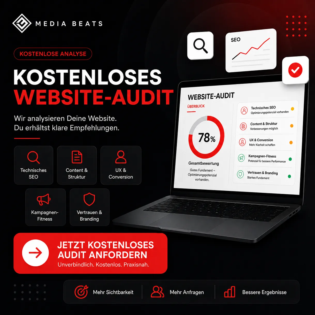
How is a landing page optimally designed? Our blog post provides you with a guide to creating a good landing page
The landing page is an important tool in a company's online marketing mix and a key component of a successful marketing strategy. Visitors land here when they click a link in a search engine or text ad, for example. The landing page is a single page without distractions or complex navigation. Ideally, it captures the reader’s desire, convinces them until they take the desired action and/or their problem is solved.
In dieser Hinsicht unterscheidet sie sich von der herkömmlichen Webseite, die größtenteils aus vielen Unterseiten und Auswahlmöglichkeiten besteht. Auf einer Homepage kann sich der Nutzer über das Unternehmen informieren, nach Kontaktmöglichkeiten suchen oder eine offene Stelle finden. Dazu kommen Produktbeschreibungen, ein Online Shop und vieles mehr. Die Unternehmensseite ist nicht auf ein bestimmtes Ziel festgelegt, sondern kanalisiert verschiedene Suchanliegen.
A landing page converts prospects into paying customers
The landing page, on the other hand, is entirely focused on conversion, meaning the prospect should quickly turn into a buyer. It is equally possible to specifically collect contact details for a newsletter or generate leads. The targeted action to be taken on the page is important. Therefore, this page has little or no navigation and is often separate from the homepage online. This prevents the prospect from opening other menu items that lead away from the desired action. The visitor should focus only on the one topic. This avoids scatter losses and addresses only the appropriate target group.
The page must match the search intention exactly and offer a solution to the problem. A text ad is often linked to the corresponding page. The ad text and target page are precisely coordinated. In this way, the company achieves a high level of consistency between search, ad text and target page. The user's question is answered immediately, as the focus is only on the offer or service.
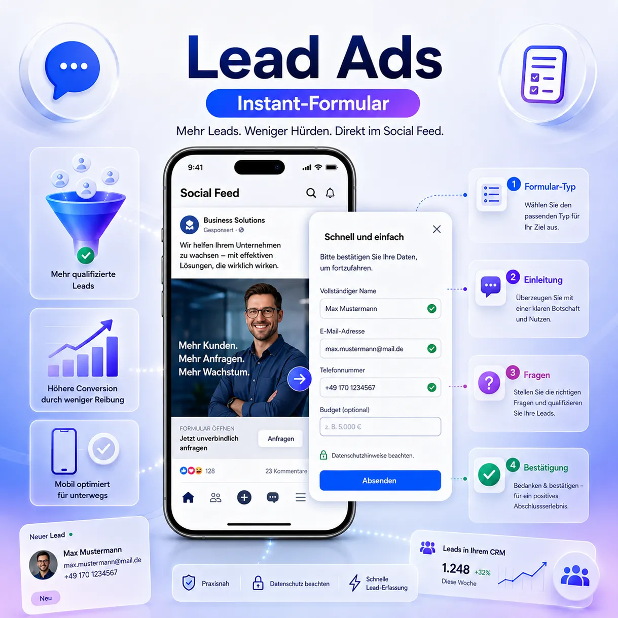
A response element is particularly important so that the reader can act more easily. This is, for example, a form or a button that directly encourages the interested party to take the desired action. This is called a “call to action” and is used to prompt the interested party to make a purchase or to enter their e-mail address. In summary, the individual page performs the following tasks:
- Sie motiviert zum Handeln, darauf ist die gesamte Landing Page ausgerichtet
- The page is all about a specific offer or product, which is the entire focus
- General information about the company does not belong on a landing page.
- The visitor lands here when clicking on an ad, a banner, or a link in a blog.
- There is only one way to order
This is how an effective landing page is structured
To achieve the highest possible conversion rate, the landing page structure must be simple and straightforward, as the visitor wants to find what they are looking for immediately. Artistic design is out of place here, as usability is the focus and a specific goal is being pursued.
It begins with a clear headline
First of all, we need to signal to the reader that they are exactly right with us, using a clear headline that focuses on the benefits of our offer. Usually, the reader clicks on the teaser in the text ad or the search engine and is curious about what comes next. Now they expect the solution. The headline should match the teaser or text ad as closely as possible, using the wording that was used there.
Kommen Sie auf den Punkt und sagen Sie worum es geht, da der Nutzer nicht lange überlegen möchte. Das Alleinstellungsmerkmal kommt zuerst. Wie macht sich das Problem im Alltag bemerkbar und wie können Sie es lösen? Die Überschrift ist ganz klar auf den Kundennutzen gerichtet. Stellen Sie den emotionalen Benefit in den Mittelpunkt, denn der Kunde fragt sich immer, welchen Nutzen er von einer bestimmten Aktion hat.
If not everything fits into the headline, use a subline. This is a smaller headline that belongs to the headline and is used as a supplement and explanation. For example, if the headline only mentions the problem. The subline then contains the benefit and a promise of a solution.
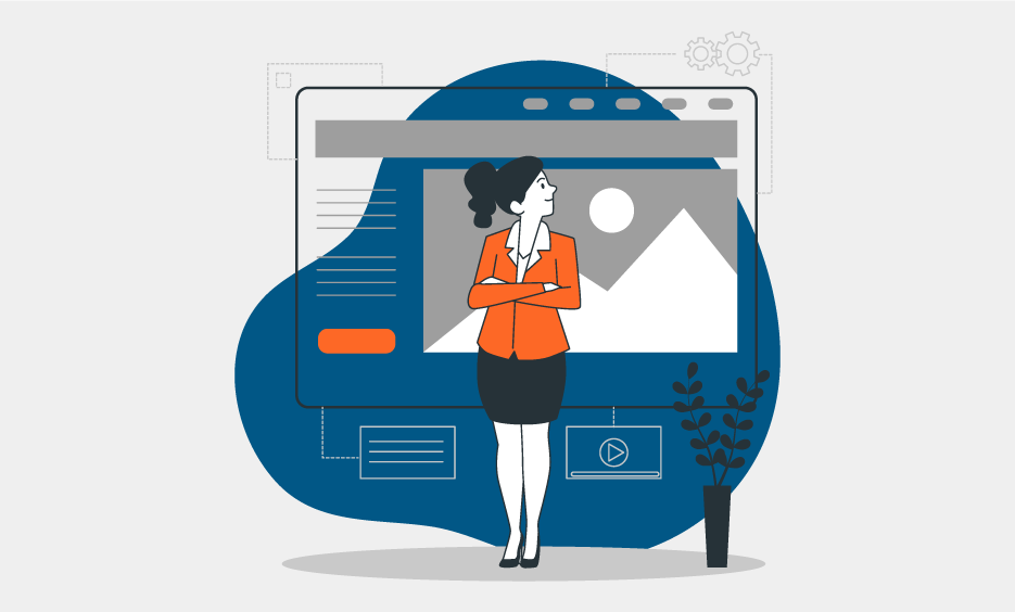
A central image as an eye-catcher
The so-called hero shot forms the eye-catcher on our landing page. Here you can visually show how your product or service is used. Ideally, the reader should recognize themselves and see how they too can solve the problem. The image should be authentic and match the headline well. Avoid stock photos that appear on many other sites. Use your own photos or have some produced. Leave out slideshows or videos as they are too distracting and the prospect gets diverted. The landing page design should remain clear and straightforward.
The benefits come first in the offer
Now present the highlights of your offer. Again, be sure to mention the benefits that your customer would have if they take you up on your offer. Features are product characteristics and benefits provide the reason to buy, as they explain how the product or service makes life easier. Feelings and emotions are also important here.
The best way to communicate the benefits of a product is with lists or bullet points. Showcases in which the product benefits are presented have proven successful. This alternates with a continuous text that is easy to read and formulated as actively as possible. Avoid negative formulations and technical jargon. Remember that the prospective customer must be so enthusiastic at the end of the page that they want to use your product or service immediately.
Build trust
Without trust, no one will order from you, so it is advisable that your customer immediately knows who they are dealing with. This starts with the company logo, which belongs in the top left corner. It is also quite appropriate to show yourself and your employees personally, as this makes your business transparent. Give a behind-the-scenes look; this builds more trust than stock photos from the internet. Seals, memberships, and awards can also appear on the website. Online shops often use the seal from Trusted Shops to provide visitors with security and reduce reservations. Consider such a page as a written sales pitch that anticipates and refutes objections.
Customer ratings help
Authentic customer reviews show that there are already satisfied customers. However, you should not write these yourself; they must come from real customers. This has a positive effect on the willingness to buy and leads to faster action.
Suitable software
You don’t need complex software to build a single page, as the content is what matters most here. Use common website builders with industry-specific templates or a plugin for WordPress. Measurement of the actions taken is important because that is the advantage online — adjustments can be made at any time. Unlike print, nothing is set in stone in online marketing.
As an online marketing agency in Munich, we are happy to advise you on selecting the appropriate software and creating a suitable landing page. Feel free to contact us!
Our blog
Latest news
With our blog, you are always close to our work, our current projects and the latest trends and developments in web and print.

Any questions?